Hi! Please help me choose a better selection color!
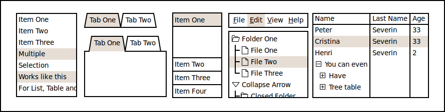
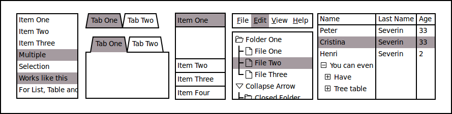
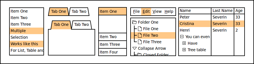
Currently the light gray color is used to show the selection in widgets like List, Table and Tree. The issue with this color is that the contrast is too low and on some monitors is hard to distinguish it against the white background. I'd like to try a different color. The objective for the color to have a better contrast but still blend well with the overall wireframy style. My feeling is that a pastel color could do a good job.
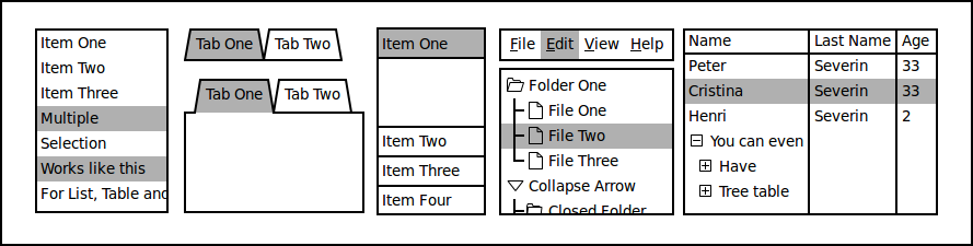
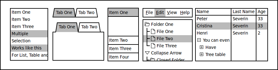
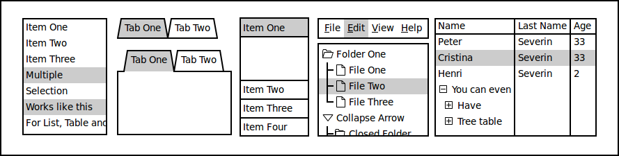
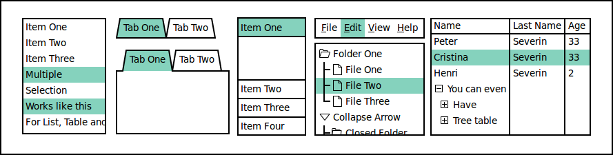
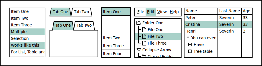
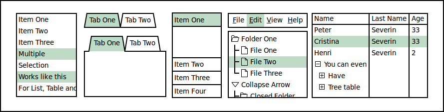
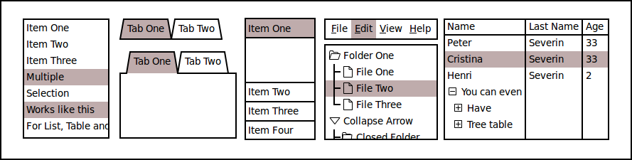
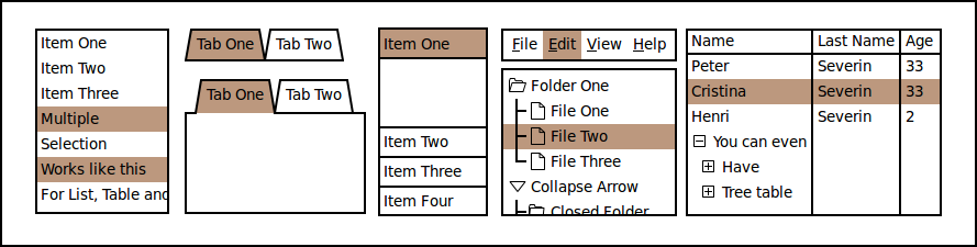
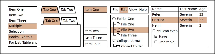
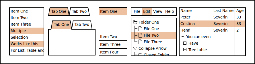
To avoid theoretical discussions I've spent some time testing different colors and made a list with those that I found interesting. In 1st position is the current color. To vote for a color just link to the image in your message. You can also propose your own color.
bgillis19 Nov 2009
Colors (1) and (5) have my preference. But wouldn't be better to let the user choose the color in a new setting of WireframeSketcher preferences ?
Thanks, bgillis! I am noting your choices down! I could certainly add a selection color preference in the future but I think it's important to have good defaults.
bgillis19 Nov 2009
As usual you are completely right :-) My color choices are the light greys because most of the time, dark greys doesn't render very well when printed. Of course it's just my point of view ;-)
bgillis19 Nov 2009
Oops... I'm mean "Gray" instead of "Grey" :-)
Marc Becker19 Nov 2009
I prefer number 5.
Ben Hoffstein19 Nov 2009
Another vote for #5, although #9 is also strangely appealing.
Something like 3 or 4 (grays) would have my preference, it's neutral, does not suggest design, and works relatively well on all printers and screens.
Alternatively, I'd like to see it move into the Eclipse preferences so you can select what works for you? Or even implement a bit of house style in the sketches.