Introduction
Welcome to WireframeSketcher User Guide. This guide is also bundled with the app and can be found at Help > Help Contents > WireframeSketcher User Guide or viewed directly in context by using Help > Show Contextual Help or pressing F1. You can also download the user guide in PDF format.
If you feel that you don’t need to read user guides then try at least skimming through the Keyboard Shortcuts section to get an idea of what’s available. It is also a good idea to familiarize yourself with the wiki syntax used for flexible text styling.
User Interface
WireframeSketcher has a flexible user interface consisting of editors and views all working together. These user interface parts can be conveniently laid out in various ways to best suit your preferences. WireframeSketcher comes with an initial arrangement that is called Wireframing perspective.
If you are using standalone version of WireframeSketcher then Wireframing perspective will be open for you by default. If you are using an Eclipse IDE then open the Wireframing perspective using Window > Open Perspective > Other… > Wireframing.
The following screenshot shows all the important views used by WireframeSketcher:
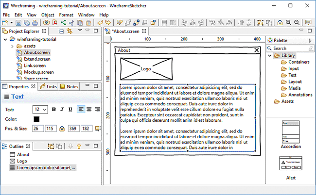
To change this arrangement, you can drag & drop views around, maximize and minimize them, make views float, or close altogether. You can always restore any closed view using Window > Show View menu. You can also restore the layout to its initial configuration of views using Windows > Reset Perspective…. You can also save various layout configurations using Window > Save Perspective As…, and then toggle between these layouts to suit better your current task.
Screen Editor
Screen Editor is where you create or modify screens that contain your wireframes. The editor works along with other views like Palette, Properties, Links and Outline. Double-click the editor’s tab to maximize it and temporarily gain more screen space. Double-click the tab again to restore editor’s position.
Storyboard Editor
Storyboard Editor is where you create or modify your storyboards. There are two editing modes that can be switched between using tabs at the bottom. Storyboard tab presents a linear view of the story. Screenflow tab lets you visualize the flow diagram for linked screens in the story.
Project Explorer
Project Explorer view is where you can explore and organize the contents of your projects. Screen (.screen) and storyboard (.story) files have distinctive icons in this view. Double-click the file to open it using the Screen Editor or Storyboard Editor.
Drag & Drop screen and image files from Project Explorer directly into Screen Editor or Storyboard Editor. Dropping screen files into Screen Editor will automatically include them as components. Drag & drop can also be used to quickly create screen links. Before using drag & drop make sure to go to Project Explorer view and uncheck the Link with Editor option ( ).
).
Copy & Paste screen and image files from Project Explorer into Screen Editor to include them as components or images. Also screens can be added this way to Storyboard Editor.
Project Explorer view lets you rename and move files around. Make use of this feature and don’t be afraid to reorganize your projects – all cross-file links will be automatically updated.
Here you can also configure project references that are useful when working with components. Right-click on a project and then select Properties > Project References.
You can control how Project Explorer responds to single and double clicks. By default files are opened on double click. You can change this by going to Window > Preferences > General where you’ll find the Open mode preference.
Projects can be organized in Working Sets. Working Sets let you see only a subset of your projects and they are helpful when you work with many projects. You can create different Working Sets and then select which Working Set to display. Use drop-down menu in view’s toolbar to select and configure Working Sets.
Palette
The Palette view is where you find the widgets library and custom assets to add to your wireframes. You can change Palette’s position to the left side of the Screen Editor and adjust other palette preferences.
Various palette layout settings can be adjusted from the context menu. Right-click inside the palette to get access to it. You can make thumbnail icons smaller and make widgets display in a list. There is also a Customize… option that allows you to hide widgets in the palette.
You can place your own widgets and images in the palette by placing them in the assets folder in the root of your project. If needed, the location of the assets folder can be changed per project. To do this right-click on the project in the Project Explorer, choose Properties > Wireframing Settings and change the Assets Folder setting.
Use Mockups Gallery to download and install pre-built assets from our online gallery. Choose Help > Add Assets from Mockups Gallery… to get started.
The Palette can also be detached from the Screen Editor and opened in its own view using Window > Show View > Palette. This will give you more layout options so that you can arrange the Palette view differently, or even make it float and move it to a secondary monitor.
Palette items can be filtered using the search field. You can also filter by a pre-defined category using the category tree below the search field.
Palette is keyboard friendly. Click on a widget and then use Arrows and Tab to navigate around. Type a letter to quickly jump to a widget that starts with it. Press Enter to add the selected widget.
Properties
The Properties view allows you to quickly edit the properties of the selected objects. If multiple objects are selected then the view lets you edit just the common properties of those objects.
If you prefer to work with your editor maximized you can detach the Properties view so it can float above the editor canvas.
Outline
The Outline view displays the overview of the edited contents. For screens it displays widgets in their Z-order, those in the back being at the top of the list and those in the front being at the bottom. For storyboards it displays the list of included screens.
Widgets can be reordered using drag and drop. Other edit operations like copy & paste and delete also work.
Links
The Links view is used for linking screens into clickable prototypes. When you select an object that can be linked to another screen, the Links view lets you edit the links for that object.
Notes
The Notes view is used for annotating screens with additional notes. When you select an object that can be annotated, the Notes view lets you edit the note text for that object.
Toolbar
The Toolbar lets you quickly access various editing and export actions.


Actions in order of their appearance are:
- Copy, Cut and Paste
- Undo and Redo
- Delete
- Export to Image
- Export to PDF
- Share Online
- Z-order arrange
- Match width and height
- Relative align
- Distribute
- Group and Ungroup
- Lock/Unlock
- Toggle bold, italic and underline styles
- Text alignment
- Zoom In and Zoom Out
- Presentation
The toolbar can be customized to remove unwanted entries. This can be especially useful if you are using WireframeSketcher inside an Eclipse IDE. To do this, right-click on the toolbar, choose Customize Perspective… and then uncheck all unwanted items in Tool Bar Visibility section.
Context Menu
Many of the actions available in the Toolbar are also available from the context menu. To open the context menu right-click on one of the selected widgets or in an empty area of the Screen Editor.
Menu
Most of the actions can be found in the top application menu. There are File, Edit, View, Object, Format, Window and Help menus.
The File menu contains various actions related to files. Actions for creating, saving, closing, printing and exporting files are found under this menu.
The Edit menu contains editing actions applicable to currently edited file. Actions for undo/redo, copy & paste and delete are found there.
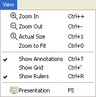
The View menu includes actions for zooming, toggling the visibility of annotations, grid and rulers, and for launching presentation:
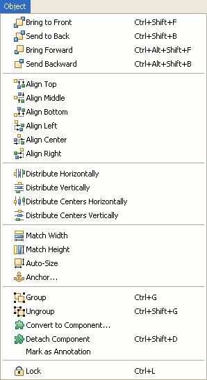
The Object menu contains editing actions applicable to currently selected objects in the editor. It includes actions for ordering, aligning, distributing, sizing, grouping etc selected objects:
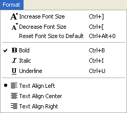
The Format menu contains editing actions related to font sizing, text styling and formatting for selected objects:
The top menu can be customized to remove unwanted entries. This can be especially useful if you are using WireframeSketcher inside an Eclipse IDE. To do this, right-click on the toolbar, choose Customize Perspective… and then uncheck all unwanted items in Menu Visibility section.
Working with Projects
Projects let you organize related wireframing resources in a folder structure. Projects map to directories in the local file system. When you create a project it’s default location is in Workspace folder. Workspace is located in your home directory and it’s where WireframeSketcher stores all the data about your projects. Optionally, you can specify a different location for a project by deselecting Use default location checkbox in project wizard. Use Project Explorer view to manage projects.
A project can be either open or closed. When a project is closed, its contents cannot be changed. The resources of a closed project will not appear in the Project Explorer, but the resources still reside on the local file system. Closed projects require less memory. When a project is open, the structure of the project can be changed and you will see its contents.
Projects can be organized in Working Sets. Working Sets let you see only a subset of your projects and they are helpful when you work with many projects. You can create different Working Sets and then select which Working Set to display in the Project Explorer view.
WireframeSketcher can work with existing projects of any type. Eclipse IDE users can use existing PHP, Java or other projects for wireframes too. You can always add assets later to your already existing projects.
Creating a New Project
Use Wireframe Project wizard to create a new wireframing project. Specify a project name, optionally change its location and then choose a template to create your project from. There are a few handy templates that can help you to get started with the desired type of project. There are also a few example projects that you can use to learn about available features and familiarize yourself with project organization. Choose Empty Project if you wish to start from scratch.
Open the Wireframe Project wizard by selecting File > New > Wireframe Project.
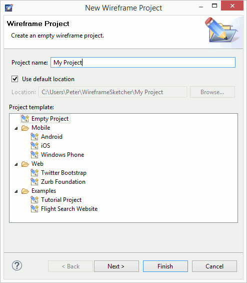
If you already have other projects in your workspace, then on the next page you can optionally configure project references that are useful for sharing project assets across projects.
Click Finish to create the project. A new screen file is automatically created and opened to get you started.
Managing Project Assets
You can add your own widgets and images in the Palette by placing them in the “assets” folder in the root of your project. If needed, the location and the name of the assets folder can be changed per project. To do this right-click on the project in the Project Explorer, choose Properties > Wireframing Settings and change the Assets Folder setting.
You can create your own assets such as components, icons and images. You can also install pre-built assets from Mockups Gallery.
Assets can be shared between projects using project references. Project references can be configured using Project Explorer. Right-click on a project and then select Properties > Project References. This mechanism lets you place assets in a global project and then reference it in other projects that also need those assets.
Mockups Gallery Assets
Download and install additional assets from our online Mockups Gallery. There you’ll find iOS, Android, Windows Phone and other stencils, various icon packs and more. Use Mockups Gallery to jump-start your work and save some valuable time. Actually project templates from Wireframe Project wizard are just assets from Mockups Gallery that you can always install later yourself.
Mockups Gallery can be opened directly in WireframeSketcher by selecting Help > Add Assets from Mockups Gallery… or the same action in Palette’s context menu. Simply navigate to the desired asset, click the download link and a wizard will open to help you add it to your project.
Working with Screens
A screen represents a single wireframe or mockup. Screens are saved in files with .screen extension and edited in Screen Editor. Screens are drawn by adding and customizing widgets from the Palette.
Creating a New Screen
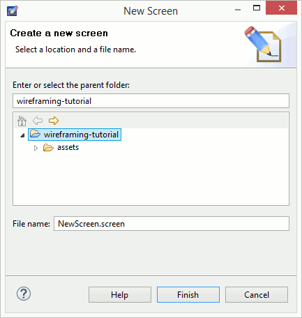
Use New Screen wizard to create a new screen. Specify the parent folder and the name of the .screen file. Make sure that you have at least one project in your workspace. If not, then you can create one using the Wireframe Project wizard.
Open the New Screen wizard by selecting File > New > Screen. Alternatively, right-click on a folder in the Project Explorer and select New > Screen:
Cloning a Screen
Use Clone Screen wizard to create a new screen as a copy of another one. When cloning a screen you have the option to inherit from it instead of copying its contents to the new screen. This option lets you to quickly create derived screens that are automatically updated when the original screen changes, without unnecessary content duplication.
Open the Clone Screen wizard by right-clicking on a .screen file in Project Explorer and choosing Clone Screen…. Alternatively, the Clone Screen wizard can be opened by choosing the Link to Screen Clone… when linking screens.
Adding Widgets
Screens are drawn by adding widgets and other assets from the Palette to them.
Widgets can be added in several different ways:
- Drag and drop the palette item onto the editor canvas. The widget will have its size calculated automatically.
- Select the palette item and then draw a bounding box in the editor canvas to place the widget and give it an initial size.
- Double-click a palette item to add it.
- Open the Quick Add dialog (Ctrl+Space), start typing a widget name, select the widget and then press Enter to place it. Press Ctrl+Enter to place the widget and immediately search for another. Instead of Enter you can also select the widget using mouse. This will close the dialog and let you place the widget using the mouse.
Selection
To select a widget just click on it. For multiple selection hold the Ctrl key while clicking to toggle the selected state of a widget. Hold Shift while clicking to add a widget to the current selection.
Selected widgets have a blue rectangle around them – move handle, and white or black squares which are resize handles. One widget that has black resize handles is called primary or anchor selection. This is the last widget selected. Relative actions such as align and match size use primary selection as their reference.
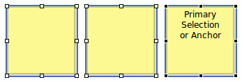
The Marquee tool gives you another selection method. Use it to drag a bounding box around widgets you want to select. Marquee tool activates automatically when you start dragging in an empty space of the editor canvas. If the screen is crowded and has little empty space then use F4 keyboard shortcut to quickly activate the Marquee tool. Use F3 to go back to the Select tool.
You can also select widgets in the Outline view which keeps in sync with the editor’s selection.
Editing Properties
The Properties view allows you to quickly edit the properties of the selected objects. If multiple objects are selected then the view lets you edit just the common properties of those objects.
Here’s a table of available properties:
| Property | Description |
|---|---|
Arrow |
Lets you toggle on and off arrow heads. |
Border |
Lets you switch the border style for Panel widget. Available styles are None, Square, Rounded and Dashed Rounded. |
Border Toggle |
Lets you toggle on and off the border for Shape, List, Table and Tree widgets. |
Button |
Lets you switch the Button’s style between Point Left, Square, Round and Point Right. Pointy variants can be used to represent iPhone/iOS buttons. |
Chart |
Lets you switch the Chart’s style between Pie, Line, Bar and Column. |
Color |
Lets you control color properties such as background, foreground and border. Alpha slider lets you change the opacity for widgets that support it. |
Component |
Displays the source screen file for Component widget. Lets you open and edit the source screen. It’s also possible to gray out a component in design mode. It’s useful for background templates that you wish to stay out of your way. Components can also be detached from their source and transformed into a group. |
Curly Brace |
Lets you switch the orientation of a Curly Brace between Left, Right, Top and Bottom. |
| Icon |
Lets you choose an icon for some widgets. When an icon is selected you can choose its size between Small (16×16), Medium (24×24), Large (32×32), Extra Large (48×48) and Extra Extra Large (128×128). Icons can also be rotated in 90 degree increments. Delete button lets you remove previously specified icon. |
| Icon Position |
Lets you switch the position of an Icon between Left and Top. This property is available for Shape and Label widgets that have an icon selected. |
Image |
Lets you choose a raster image file from available assets for Image widget. Black and White toggle lets you automatically render colored images in grayscale colors. Image can be flipped horizontally and vertically and rotated in 90 degrees increments. |
Label Rotation |
Lets you rotate the text of a Label widget in 90 degree increments. |
Line Style |
Lets you control the line style for Arrow, Shape, Horizontal and Vertical Line. Available styles are Solid, Dotted and Dashed. |
List |
Lets you control the row height and the visibility of horizontal grid lines for List and Table widgets. Additionally you can control the visibility of vertical lines and header for Table widget. |
Name |
Lets you assign a name to a Group widget. |
Position & Size |
Gives you a fine control over position and size properties. Use arrow keys to increment and decrement values. Lock toggle lets you lock a widget in place so it gets out of your way. Auto-size button forces a widget to resize to its preferred size. When editing groups or components the anchor drop-down becomes available and allows to control anchor settings. |
Screen Font |
Lets you specify a font per-screen. To access this property click in the empty space in Screen Editor. You can also revert to a global font configured in WireframeSketcher’s preferences. If the configured font doesn’t exist on your system then its name will be displayed in red to indicate that. |
Screen Theme |
Lets you specify choose between Clean and Sketch theme for a screen. To access this property click in the empty space in Screen Editor. Default theme choice makes the screen use a global theme configured in WireframeSketcher’s preferences. |
Selection |
Lets you specify the selected item or row. |
Selection Toggle |
Lets you toggle the selected state for Checkbox and Radio Button widgets. |
Shape |
Lets you choose the type of Shape widget. Possible choices are Ellipse, Rectangle, Rounded Rectangle, Round Rectangle, Diamond, Star, Parallelogram, Triangle, Right Triangle. Some shapes can be rotated in 90 degrees increments. |
State |
Lets you specify the state of the widget. This mostly applies to input (form) widgets. Possible choices are Normal, Selected, Disabled, Focused. |
SVG Image |
Lets you choose the .svg image file from available assets for SVG Image widget. Image can be flipped horizontally and vertically and rotated in 90 degrees increments. |
Tabs |
Lets you change the orientation of Tabs and Tabbed Pane widgets. Possible choices are Top, Bottom, Left and Right. |
Text |
Lets you specify the font size and and toggle Bold, Italic and Underline font styles. For some widgets you can also specify Left, Center or Right text alignment. For Text and Text Area widgets you can also set the line height (leading). Line height is expressed as a multiple of font size. |
Tooltip |
Lets you specify the orientation of Tooltip widget. Possible values are Bottom Left, Bottom Right, Top Left and Top Right. |
Scrollbar |
Lets you toggle on and off the visibility of vertical scrollbar. When visible, you can also specify the position of the thumb. |
Window |
Lets you toggle on and off the visibility of minimize, maximize and close buttons for Window widget. |
Moving and Resizing
To move selected widgets just drag them using the mouse. Use Arrows to adjust the position of widgets in increments of 2px using the keyboard. Ctrl+Arrows let you adjust the size. Shift+Arrows and Shift+Ctrl+Arrows let you do the same thing in increments of 20px.
To resize selected widgets just grab with the mouse one of the handles and drag it. Some widgets cannot be resized in one or both directions. In this case handles will appear only for directions that work.
Move and resize operations snap to guides, grid and geometry (smart guides). Use Alt key to temporarily disable snapping. Snapping behavior can be adjusted in preferences.
Most of the widgets are capable of calculating their size automatically. For example the Button widget will adjust its size to fit the text. If a widget is resized explicitly then it will keep this new size. You can use the Auto-Size action to turn back on the auto-sizing behavior.
During the move and resize operations you can see the resulting position and size displayed in the status bar. The same information is also displayed in a small overlayed tooltip when the widget’s size allows it.
For more precision use Align, Size and Distribute actions available from the from the Toolbar and the Context Menu.
You can lock widgets in place (Ctrl+L) to avoid moving or resizing them by accident.
Deleting Widgets
To delete selected widgets just hit Delete. The same operation is available from the Toolbar and the Context Menu.
Ordering Widgets
When layed on the canvas widgets are drawn from back to front. Widgets placed in the front cover widgets placed in the back. To change the order in which widgets are drawn you can use the Object > Send Backward and Object > Bring Forward, Alt+Ctrl+Shift+B and Alt+Shift+Ctrl+F respectively. Widgets can also be reordered using drag and drop in the Outline view.
Grouping Widgets
You can group widgets so that they can be manipulated together as one object. This is also useful for creating reusable components. Hit Ctrl+G to group the selected widgets. Use Ctrl+Shift+G to ungroup. You can assign a name to a widget group. This is useful when creating reusable components.
You can “enter groups” to edit their contents using double-click or Enter. Use Escape to exit group editing.
It’s possible to control how widgets behave when their parent group is resized. This is done by anchoring widgets to the edges or the center of the group. There are 5 possible anchor settings for each direction. These are None, Left, Center, Right and Left Right (or Fill) for horizontal direction, and Top, Middle, Bottom and Top Bottom (or Fill) for vertical direction. By combining vertical and horizontal anchors it’s possible to make the widget stay in corners, center or fill the parent group which is useful when designing reusable components.
Anchor settings have the following interpretation:
- None – widget’s position and size are scaled proportionally with the group’s size. This is the default setting.
- Left, Top, Right, Bottom – widget maintains it’s distance from the respective group’s edge. Widget’s size is preserved unless it’s anchored to the opposite edge in which case it will stretch.
- Center, Middle – widget maintains it’s distance from the group’s center. Note that this does not mean that the widget is actually centered unless it was centered manually.
Anchors are specified by using Object > Anchors… entry from the top menu or using the anchor drop-down in Properties View. The anchor drop-down offers quick access to the most useful (but not all) anchor combinations. Click the anchor icon for more fine grained control.
Duplicating Widgets
You can use Copy and Paste, Ctrl+C and Ctrl+V respectively to quickly duplicate the selection. This works both in the same screen and across multiple screens.
Another option is to use Duplicate with Ctrl+D. Duplicate is a bit smarter than a simple Copy and Paste. When you duplicate some widgets, move the copy and then duplicate the copy again, the duplicate action will position the second copy at the same relative distance from the first copy, as measured between the first copy and the original widget. Use this feature to quickly create for example a column of input fields, or a row of boxes.
Yet another option is to press Ctrl and then drag the selection to quickly duplicate it.
Editing Text
Many of the available widgets can display text in one way or the other. You can quickly edit this text in-place. To open the in-place editor just double-click the widget or hit Enter. When finished with editing press the Enter key.
When editing widgets with multi-line text the Enter key serves to make new lines. In this case use the Ctrl+Enter combination to close the editor.
You can cancel the current edit by hitting the Esc key.
Certain widgets allow multiple items to be entered using comma (,) or newline as separator. When required, commas can be escaped using the \, syntax.
You can force multiple lines in widgets like Table, Placeholder, Button, Link and others by using the \n sequence, which can be conveniently inserted using Shift+Enter.
Additionally, a wiki-like markup syntax can be used to style the text.
| What you type | What it looks like |
|---|---|
| *bold text* | bold text |
| _italicized text_ | italicized text |
| +underlined text+ | underlined text |
| -struck out text- | |
| ~disabled text~ | disabled text |
| %(color:red)colored text% | colored text |
| %(color:FF0000)colored text% | colored text |
| %(bgcolor:yellow)text with background% | text with background |
| %(font:+2)bigger text% | bigger text |
| %(font:-2)smaller text% | smaller text |
| %(font:14)14 points text% | 14 points text |
| +*_combine styles_*+ | combine styles |
| [link] | link |
| {icon-name} | insert the icon named “icon-name” |
| ${screen-name} | insert the name of the screen |
| ${screen-path} | insert the path of the screen |
| ${screen-mtime} | insert last modification time of the screen |
| ${current-time} | insert current time during print/export |
| ${page-number} | insert current page during print/export |
| ${page-count} | insert total page count during print/export |
| \*escape markup\* | *escape markup* |
| * A * Bullet ** List |
|
| # A # Numbered ## List |
|
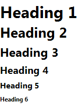
| h1. Heading 1 h2. Heading 2 h3. Heading 3 h4. Heading 4 h5. Heading 5 h6. Heading 6 |
 |
Use Ctrl+Space to open auto-completion popup with the list of available icons and macros. To narrow down the list of proposals just continue typing a search keyword directly in the text. For macros start with the ‘$’ character. Auto-completion is smart enough to recognize what you are trying to do.
Creating Text Links
You can use [link] link syntax to create working links embedded in text. This works with Table, Text, Text Area, Label, Note, Tooltip and Curly Brace widgets.
Working with Tables
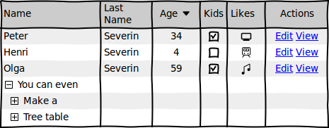
To insert a table use the Table widget from the Palette view. Tables are configured via a more complex syntax in CSV format: one line for each row with commas or tabs being used as separators for columns. Tables allow you to insert icons, line returns, specify column alignments and sizes.
Here’s an example:
Name,Last\nName,Age v,Kids,Likes,Actions
Peter,Severin,34,[x],{computer},[Edit] [View]
Henri,Severin,4,[],{train},[Edit] [View]
Olga,Severin,59,[x],{note},[Edit] [View]
[-] You can even
  [+] Have
  [+] Treetable
Which renders to this:
Cell Attributes
Various cell attributes can be given using special instructions at the beginning of a table cell. The general syntax is:
instructions. Cell Content
Column Aligns and Widths
Cell attributes can be used to specify column aligns and widths. Here are a few examples that show what’s available:
<. Align to left, (align:left). Also align to left
>. Align to right, (align:right). Also align to right
=. Center, (align:center). Also center
(w:30). Width of 30 pixels, (w=30). The same, (width:30). Also works
=(w=30). Width and align, (w:30)(align=center). The same, (width:30)(align:center). Also works
Note that specifying column widths only works when given in the header row. Column widths are expressed in pixels, but limited to the minimum width of the column’s content. If you wish to make a column as narrow as possible then give it the width of 1 pixel using: (w:1).
Cell Background
Cell attributes can also be used to control cell background. Here’s an example:
(bg:red). Red cell, (bgcolor:#0000FF)(align:left). Blue cell
Row Background
Row attributes can be used to control row background. Here’s an example:
(bg:red)|Row with red background
|Row with default selection background
(bgcolor:#00F)|Row with blue background
Regular row
This syntax also works for List and Tree widgets.
Using Icons in Tables
You can insert any icon using the {icon-name} syntax. There are also some text shortcuts and their equivalent icon syntax:
- Selected checkbox: [x], {checked}
- Unselected checkbox: [], [ ], {unchecked}
- Selected radio button: (x), (*), (o), {selected}
- Unselected radio button: (), ( ), {unselected}
- Collapsed tree node: [+], {expand}
- Expanded tree node: [-], {collapse}
- Ascending sort: ^, {asc}
- Descending sort: v, {desc}
- Neutral sort: v^, ^v, {neutral}
Using Links in Tables
You can use [link] link syntax to create working links.
Breaking Text in Multiple Lines
Insert \n sequence inside the text to break it in multiple lines. Use Shift+Enter shortcut to do it without actually typing the sequence.
Multiple Selection in Tables
To mark a row as selected you can prepend it with ‘|’ character, like this:
|This is a selected row
Using spreadsheet to edit data
When editing complex tables you can use a spreadsheet application like Excel, Numbers, LibreOffice Calc or Google Sheets (use the last link to quickly open a new spreadsheet page). Just copy the contents of the Table widget and then paste it to spreadsheet. After you are done with editing the data, select the range of cells to transfer and then copy & paste their contents back into the Table widget.
Note that to make copy & paste from other apps work as seamlessly as possible, the Table widget accepts both comma and tab characters as cell separators.
Working with Images
The Image widget lets you use raster image files in your wireframes. Supported formats are BMP, GIF, JPEG, PNG and TIFF. The image file must be present in your project before you can use it in your screens.
Images can be resized, rotated, and flipped horizontally and vertically. Additionally you can turn on the Black and White mode to make the image blend in better with the rest of your wireframe. You can also toggle a border around the image and specify a text label to be shown above it.
You can use several methods to add an image to a screen:
- Drop the Image widget from the palette. You’ll be prompted for an image file.
- Drag & Drop the image file directly from the Project Explorer view into the editor. You may have to uncheck the Link with Editor option (
 ) in Project Explorer view first.
 - Drag & Drop the image from local file system or from the browser. The image will be copied to assets folder. Later you can rename the image file in Project Explorer.
- Paste an image from the clipboard. You’ll be prompted for a file name to save the image to.
- Copy & Paste image files from the Project Explorer view into the editor.
If no image is specified then the Image widget behaves like a regular placeholder.
Working with SVG Images
The SVG Image widget lets you work with SVG vector graphic images. The .svg image file must be present in your project before you can use it in your screens.
SVG images can be resized, rotated, and flipped horizontally and vertically.
SVG images are the ideal choice for custom clipart and new widgets. Try using ClipSafari.com to find royalty free clipart for your wireframes. SVG images can also be used for custom icons.
Unlike raster images, SVG images inherit the current theme used by the screen. If the screen is using sketchy style then SVG images will be sketchy too. There is also a limited control over colors. If the original SVG image is black & white then you’ll be able to change these colors in Properties View. To increase possible uses, SVG images can be rotated, flipped horizontally and vertically.
To use an SVG image you can:
- Drop the SVG Image widget from the palette. You’ll be prompted for an .svg image file.
- Drag & Drop the .svg image file from local file system or from the browser. The image will be copied to assets folder. Later you can rename the image file in Project Explorer.
- Drag & Drop the image file directly from the Project Explorer view into the editor. You may have to uncheck the Link with Editor option (
 ) in Project Explorer view first.
 - Copy & Paste image files from the Project Explorer view into the editor.
Advanced Uses
By default SVG images are scaled as specified by the SVG standard. In particular this means that the stroke width is scaled too. WireframeSketcher has a few proprietary tricks that you can use for more control over the rendering and layout. The .svg file can include the ws-layout attribute in <svg> tag:
<svg
   ...
   ws-layout="non-scaling-stroke">
If you are using Inkscape editor then you can add this attribute using Edit > XML Editor. Inkscape will preserve it.
The non-scaling-stroke value ensures that the stroke width does not scale. There are some other values that you can use for different scaling strategies. Here’s what you need to do to get 9-slice scaling, a popular scaling method in Adobe tools:
<svg
   ...
   ws-layout="scale-9">
   ...
       <rect
            id="ws-guides"
            width="33"
            height="7"
            x="26"
            y="16"/>
   ...
Note the scale-9 attribute and also the extra element with id ws-guides that is used to define a 3×3 scaling grid (this element is not rendered). 9-slice scaling strategy only resizes the middle band without distorting corners.
In Inkscape editor use Object > Object Properties to define a custom id for an element.
There are some other less important scaling strategies. scale-3-h and scale-3-v are basically scale-9, but only on horizontal or vertical axis. The other axis gets non-scaling-stroke scaling. Then there is a more advanced scale-25 strategy that works with ws-guides-1 and ws-guides-2 elements to define a 5×5 grid. It’s similar to scale-9 but you get an additional middle band that does not scale.
All these scaling strategies keep the stroke width constant and don’t scale it.
If this is not enough then it’s also possible to use embedded JavaScript with onresize event to control SVG scaling programmatically. More than that, many widgets support Skin property that can be specified by editing screen XML file and adding a skin attribute that points to .svg file. With this approach you can create you own stencils with custom widgets that behave like any other built-in widget. See skinning widgets documentation for more details.
You can see some concrete examples of custom widgets in Shapes and iPad stencils.
When creating SVG images that need more precision make sure to snap coordinates and sizes to integer values. Here’s a template .svg file that you can use with Inkscape. It defines a 1×1px grid for automatic snapping.
Note that WireframeSketcher has a limited support for gradients and will approximate them with solid colors.
Working with Icons
WireframeSketcher comes with 200 vector, monochrome icons that you can use in your wireframes and that are free to use in your own websites or apps. Icons work at any size, can be colored, rotated, and used virtually with any object.
Here’s a list of widgets that let you specify an icon directly: Alert, Icon, Label, Button, Shape, Menu. Additionally there is a wiki syntax that lets you embed icons in any text. Some widgets will let you also change the icon’s color.
To explore available icons just use the Icon property in the Properties View to open the Icon Chooser dialog:
The icon library can be extended with custom icons. Mockups Gallery provides several icon packs that can be used to extend your icon selection. If those are not enough then explore other websites like The Noun Project that provide free and non-free icons in SVG format.
To add your own custom icon in SVG format follow these steps:
- Create a folder under assets that starts or ends with icons. For example CustomIcons. Another option is to prefix the icon name with icon, e.g. icon-refresh.svg.
- Copy & Paste the icon file in the icons folder. Note that the final icon list is flat so make sure that the icon name is unique.
- Add a widget that has Icon property to your screen and then open the Icon Chooser dialog and find there the new Custom category with your icon(s).
Custom icons can be shared between projects using project references.
Working with Components
Components let you create reusable bits and share them across multiple screens. This is helpful for creating common parts like navigation, headers and footers. Components can then be used by other screens without unnecessary duplication. Changes to a component are automatically reflected in every place it is used. Components in WireframeSketcher behave a lot like “masters” in other tools, or “master objects” to be more precise. However components are much more flexible – hence the name.
Any regular screen can be used as a component. Use this feature to create screen variations without content duplication. Additionally, you can place multiple components in the same screen file using named groups. This is the recommended way to create stencils.
You can quickly extract selected widgets into a component using Convert to Component… action from the context menu. Choose a new screen file to save the component to and click Finish.
Screens that to be used as components can also be placed in the assets folder in the root of your project. These screens will be automatically loaded into the Palette. Use Mockups Gallery to add pre-built assets.
Assets can be shared between projects using project references. Project references can be configured using Project Explorer. Right-click on a project and then select Properties > Project References. This mechanism lets you place assets in a global project and then reference it in other projects that also need those assets.
Like images, components can be added using several methods:
- Add the component from the Palette if it was placed in assets folder
- Add the Component widget from the Palette and choose the screen file to use as component
- Drag & Drop screen files directly from the Project Explorer view into the editor. You may have to uncheck the Link with Editor option (
 ) in Project Explorer view first.
 - Copy & Paste screen files from the Project Explorer view into the editor.
Overriding properties
Components come with an inheritance mechanism that allows component instances to be customized by overriding their individual properties. When the source is changed, the instance remains linked to it and is updated, with overrides preserved. To override properties, first “enter” the component in Overriding properties mode using double-click or Enter. Edit the component’s contents in the usual way by changing properties, moving, resizing or deleting widgets. Hit Escape to exit component editing.
Note that the Overriding properties mode has some limitations. Specifically, it’s not possible to add/nest new components while in this mode. Pasting, duplicating or adding new components from the palette while being in this mode will result in a warning message. The solution to this issue is to exit this mode and to overlay new components above instead of nesting them inside.
A component can also be detached from its original source and copied into the current screen as a group. Detaching the component will automatically apply any overrides and make them part of the copy. To detach the component choose “Detach Component” from the context menu.
Designing components
When designing components use anchors to control how widgets behave when the component is resized. Using anchors it’s possible to combine simple shapes and objects into complex components that resize well and are more reusable.
Consider using SVG images for new components. You can place helper images in assets directory and use them in your stencil. Prefix image names with underscore, e.g. _ipad_popover.svg, to hide them from the Palette.
Working with Annotations
Some widgets are treated as annotations and can be hidden in exported documents and in presentation mode. By default all widgets listed under the Annotations category in the Palette are treated as such. You can adjust which widgets to be treated as annotations by using the Mark as Annotation action from the context menu.
You can also choose to show or hide annotations while editing screens using View > Show Annotations action from the top menu.
If you don’t wish to mix annotation widgets with other objects of your screen then you can use notes as an alternative.
Working with Notes
Notes represent an alternative way to annotate your screens without mixing annotation widgets with the main contents of the screen. Notes can be added to any object using the Notes view, and can contain additional description that should be attached to that object.
Objects that have an attached note are displayed with a small overlay icon in the top right corner to indicate that. You can attach a global note to the screen itself. Click in an empty area of the Screen Editor and then edit the note in the Notes view.
If you need to attach a note to some custom area, not associated directly with an object, then use Hotspot widget to do that. Overlay the Hotspot over the desired area and then add the note to it.
You can choose to show or hide note overlays, together with annotations, using View > Show Annotations action from the top menu.
The text of the note accepts and interprets the wiki syntax that you can use to style it.
Depending on your presentation choice, notes will be exported and presented separately, so that you can view them alongside with your screens.
Use Notes to provide things like descriptions, explanations, more extensive documentation, and specifications to designers and developers.
Custom Properties
Custom id and data properties can be set on any widgets. These properties then can be extracted from the screen XML file using your own or 3rd party tools.
To set custom properties use the Custom Properties… action from the Context Menu.
Working with Storyboards
A storyboard is a sequence of screens that shows how the UI changes in time as the result of user actions. Storyboards are saved in files with .story extension and edited in Storyboard Editor. Once the storyboard is created, it can be exported to a multi-page, clickable PDF or HTML document or presented directly on screen.
Storyboards can generally be used to represent any sequence of user interactions, or state changes. For example you can use storyboards to show the steps of a shopping checkout process; prototype a multi-step wizard dialog; or document more complex things like UI animations produced by AJAX events in a web application. Storyboards are saved in files with .story extension.
Storyboards provide a Screenflow view that lets you visualize complex navigation flows between screens in a more graphical way. If screens are linked together then the Screenflow will show link relationships between them.
Use F5 to launch a full-screen presentation of your storyboard.
Creating a New Storyboard
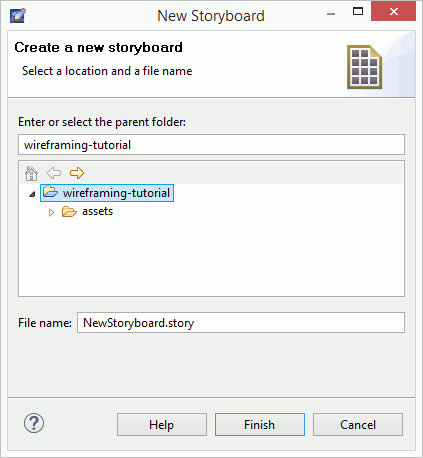
Use New Storyboard wizard to create a new screen. Specify the parent folder and the name of the .story file. Make sure that you have at least one project in your workspace. If not, then you can create one using the Wireframe Project wizard.
Open the New Storyboard wizard by selecting File > New > Storyboard. Alternatively, right-click on a folder in the Project Explorer and select New > Storyboard:
Adding Screens
To construct your storyboard, add to it screens that are part of the story sequence.
To add a screen to a storyboard you can use several methods:
- Use the Add Screen… button in the editor. You can add multiple screens at once or choose to create a new one.
- Drag & Drop screen files directly from the Project Explorer view into the editor. You may have to uncheck the Link with Editor option (
 ) in Project Explorer view first.
 - Copy & Paste screen files from the Project Explorer view into the editor.
Nesting Storyboards
Storyboards can be nested one inside the other in order to create more modular screen flows. To add a nested storyboard use one of these methods:
- Drag & Drop storyboard files directly from the Project Explorer view into the editor. You may have to uncheck the Link with Editor option (
 ) in Project Explorer view first.
 - Copy & Paste storyboard files from the Project Explorer view into the editor.
Editing Storyboards
Use drag & drop to change the order of screens in the storyboard. Screens can also be rearranged using the Outline view. You can also use drag & drop to arrange screens in the screenflow view.
When working with storyboards you’ll often need to create slight variations of the same screen. Components let you easily achieve this without unnecessary content duplication. Right click on a screen in the storyboard and choose Clone Screen…. In the opened wizard you’ll be given the option to inherit from an existing screen instead of copying the contents of the cloned screen. This option allows to quickly create derived screens that are automatically updated when the original screen changes. You can also choose to create a simple copy.
You can easily rename screens and storyboards directly from the Storyboard Editor. Right click on the object you wish to rename and choose Rename.
Linking Screens
Screen links let you create simple interactive prototypes for your website or software application. Linked screens then can be arranged into storyboards to present and export them together.
To link two screens select a widget and then specify the linked screen using the Links view. Widgets with multiple items allow you to specify a link target for each of them. Certain text widgets also let you use link syntax to highlight parts of text that you can then specify a link for. A small yellow overlay icon lets you quickly see where your links are. You can click on it to open the link.
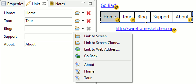
If you need to attach a link to some custom area, not associated directly with a widget, then use Hotspot widget to do that. Overlay the Hotspot over the desired area and then specify the link for it.
Linked screens can be located in any folder or even in another another project. To choose the linked screen, click the Link to Screen… icon and search for the desired screen.
Clicking on the drop-down arrow icon besides the Link to Screen… icon will present you with more linking options:
- Link to Screen Clone… is a quick way to clone the current screen and link to it, all in one step.
- Link to Web Address… lets you specify an external link, like http, mailto or another type. External links are marked using a slightly different overlay icon in the Screen Editor.
- Go Back lets you specify a back link that goes to the previous screen in the navigation history. Note that back links are of limited use in PDF documents as only Adobe Acrobat software supports them.
- Quickly choose from a list of screens located in the same folder with the edited screen.
Another way to link screens is to drag & drop .screen files from the Project Explorer view into the Screen Editor. This is done by dragging screen files while holding the modifier key (Alt or Ctrl+Shift on Windows, Ctrl on Mac, Ctrl+Shift on Linux). When you do this the mouse cursor changes to indicate linking mode and widgets that can be linked are highlighted under the cursor while you drag over them. Drop the screen file to create the link. Note that you may have to uncheck the Link with Editor option ( ) in Project Explorer view first.
Normally links will show through other widgets in presentation mode and in exported documents. In some situations it’s desirable to be able to emulate the behavior of overlapping windows and hide links that are behind other widgets. The following widgets allow you to achieve that:
- Widgets in Containers category: Accordion, Alert, Browser, Group, Panel, Tabbed Pane, Window
- List, Tree and Table widgets with a non-transparent background
- Popup, Button Bar, Vertical Button Bar
To remove a link for an item use the Remove Link icon.
To test your prototype launch the full-screen presentation mode. Clickable areas are highlighted and clicking on them takes you to the linked screen. You can disable link highlighting from the context menu. Use Arrow keys to go back to the previous screen in the navigation history.
You can also create clickable, multi-page PDF and HTML documents. To do so, put all the linked screens of your prototype into a storyboard and then export it.
Keyboard Shortcuts
Here is a list of available shortcuts. You can change these shortcuts and define new ones using the Window > Preferences > General > Keys preferences page. Open this page and then type WireframeSketcher in the filter field to list all the available actions. Mac OS X users, please also read the Keyboard Shortcuts on Mac OS X section.
| Editing | |
|---|---|
| Ctrl+Z | Undo last operation |
| Ctrl+Y | Redo last undone operation |
| Ctrl+C | Copy selection. Follow by a Ctrl+V to duplicate the selection. Use Ctrl+D to duplicate with a single keystroke. |
| Ctrl+X | Cut selection |
| Ctrl+V | Paste the contents of the clipboard |
| Ctrl+Shift+V | Paste in Place. Pasted widgets are placed at their original coordinates. |
| Ctrl+D | Duplicate selected widgets. You can move duplicated widgets and then duplicate them again to create a new copy at the same offset. |
| Del | Delete selection |
| Ctrl+G | Group selected widgets |
| Ctrl+Shift+G | Ungroup selected group |
| Ctrl+L | Lock/Unlock selected widgets |
| Ctrl+Space | Quick add |
| Ctrl+B | Toggle bold style |
| Ctrl+I | Toggle italic style |
| Ctrl+U | Toggle underline style |
| Ctrl+] or Ctrl+> | Increase font size |
| Ctrl+[ or Ctrl+< | Decrease font size |
| Ctrl+Alt+0 | Reset font size to default |
| Ctrl+Shift+F | Bring selected widget to front |
| Alt+Ctrl+Shift+F | Bring selected widget one level forward |
| Ctrl+Shift+B | Send selected widget to back |
| Alt+Ctrl+Shift+B | Send selected widget one level backward |
| Ctrl+Shift+D | Detach selected components |
| Ctrl+T | Show/Hide annotations |
| Ctrl+R | Show/Hide rulers |
| Ctrl+’ | Show/Hide grid |
| Inline Text Editing | |
| Enter, Ctrl+Enter, F2 or double-click | Edit the text of the selected widget |
| Esc | Cancel current edit |
| Enter | Commit current edit |
| Ctrl+Enter | Commit current edit for widgets with multiline text |
| Ctrl+Space | Insert an icon |
| Shift+Enter | Insert a \n multi-line separator |
| Moving and Resizing | |
| Arrows | Nudge selection by 1px |
| Shift+Arrows | Nudge selection by 10px |
| Ctrl+Arrows | Nudge resize selection by 1px |
| Ctrl+Shift+Arrows | Nudge resize selection by 10px |
| Esc | Cancel current move/resize operation |
| Holding Alt | Disable snapping |
| Holding Ctrl | Centered resize |
| Holding Shift | Constrained move or resize. Move horizontally, vertically or on a diagonal. Resize while keeping the aspect ratio. |
| . and > | Cycle between resize/move handles. Once selected a handle use arrows to move/resize. |
| Selection | |
| Shift+Click | Add to selection |
| Ctrl+Click | Toggle selected state of a widget |
| Ctrl+Drag | Duplicate selected widgets using mouse. You can duplicate duplicated widgets again at the same offset using Ctrl+D. |
| Ctrl+A | Select all widgets |
| F3 | Activate selection tool |
| F4 | Activate marquee tool |
| Zoom | |
| Ctrl++ | Zoom In |
| Ctrl+- | Zoom Out |
| Ctrl+1 | Actual Size |
| Ctrl+0 | Zoom to Fit |
| Ctrl+MouseWheel | Zoom In and Zoom Out |
| Other | |
| Ctrl+N | Create new project, folder, screen or storyboard |
| Ctrl+P | |
| Ctrl+Shift+I | Export to image |
| Ctrl+Shift+P | Export to PDF |
| Ctrl+Shift+O | Share Online |
| Ctrl+Shift+C | Export image to clipboard |
| F5 | Launch full-screen presentation mode |
| Alt+Enter | Open widget’s properties |
| Space+Drag | Scroll around using panning mode |
| MouseWheel | Vertical scroll |
| Shift+MouseWheel | Horizontal scroll |
| Ctrl+F6 | Next editor |
| Ctrl+Shift+F6 | Previous editor |
| Ctrl+Shift+E | Switch to editor… |
| Ctrl+S | Save changes |
| Ctrl+W | Close current editor |
| Ctrl+Shift+W | Close all editors |
| Holding Ctrl+Shift or Ctrl or Alt | Activate link mode while dragging screen files. See linking screens. |
| Storyboard Editor | |
| Ctrl+D | Clone selected screen |
| F3 or Alt+Shift+R | Rename selected screen or storyboard |
| Properties View | |
| Arrows | Increment/decrement values by 1 in numeric fields |
| Ctrl+Arrows | Increment/decrement values by 2 in numeric fields |
| Shift+Arrows | Increment/decrement values by 10 in numeric fields |
| Ctrl+Shift+Arrows | Increment/decrement values by 20 in numeric fields |
| Shift+Enter | Resize while keeping the aspect ratio in width and height fields |
| Palette View | |
| Arrows,Tab,Shift+Tab | Navigate around |
| Letters | Jump to widget that starts with the typed letter |
| Enter | Add selected widget |
| Color Picker | |
| Ctrl+C | Copy selected color as HTML hex code |
| Ctrl+V | Paste custom color as HTML hex code or color name |
| Project Explorer | |
| Ctrl+D | Clone selected screen |
| Ctrl+C | Copy selected resources |
| Ctrl+X | Cut selected resources |
| Ctrl+V | Paste resources |
| F2 | Rename selected resource |
| Presentation Mode | |
| Arrows,N,Page Down,Space | Go to next screen |
| Arrows,P,Page Up,Backspace | Go to previous screen |
| Ctrl+L or L or Shift | Toggle link highlighting |
| Ctrl+A or A | Toggle annotations |
| Spy Plugin | |
| Alt+Shift+F5 | Export the wireframe of the current window/dialog into the clipboard |
Mac OS X
If you are a Mac OS X user then you can generally replace Ctrl with Command key in the above table. Shortcuts that do not fall under this rule are listed below:
| Editing | |
|---|---|
| Ctrl+Space | Quick add. This can come in conflict with Spotlight. You can change the shortcut used by Spotlight in System Preferences. A good alternative is Command+Space. |
| Selection | |
| Alt+Drag | Clone selected widgets |
| Moving and Resizing | |
| Holding Ctrl | Disable snapping |
| Holding Alt | Centered resize |
Exporting your Work
To show off your work you can export screens and storyboards to PNG, PDF and HTML formats, share them online or print.
Exporting to Image
Use the Export to Image wizard to export your wireframes to a PNG image, or to copy the exported image to clipboard. Specify the destination folder and the file name. To export only some parts of your wireframe, make sure to select them in the Screen Editor first and then choose Selection only option. Use the Scale option to adjust the resolution of the exported image.
Use Export to Image action to open the wizard. This action can be invoked from the Toolbar, Context Menu or just by pressing Ctrl+Shift+I shortcut.
Exporting to PDF
Use the Export to PDF wizard to export your wireframes to a PDF document. Specify the destination folder and the file name. You can export to PDF both screens and storyboards, however it’s only with storyboards that you can create clickable, multi-page PDF documents.
Use Export to PDF action to open the wizard. This action can be invoked from the Toolbar, Context Menu or just by pressing Ctrl+Shift+P shortcut.
Exported PDF documents are vector based most of the time. This makes PDF documents look good at any resolution and zoom level. Texts are selectable and can be easily copied from the document.
However, in a particular case, when screens contain characters that are not supported by document’s font, the PDF export switches to image-based variant. This means that each page will contain an exported image of the screen, instead of a vector version.
Sharing Online
Use the Share Online wizard to securely share your wireframes online on WireframeSketcher servers (wiresketch.com). You can share both screens and storyboards, however it’s only with storyboards that you can create clickable, multi-page presentations.
Use Share Online action to open the wizard. This action can be invoked from the Toolbar, Context Menu or just by pressing Ctrl+Shift+O shortcut.
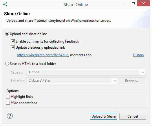
After the export finishes, the link to your storyboard will open automatically in the browser. It’s a secure, unique, hard-to-guess link. Copy it from the browser’s address bar and then share it with your team or with your clients.
When sharing your screen or storyboard the next time you can choose to update a previously uploaded link. The History dialog lets you choose a different link to update or delete links from our servers.
You can also choose to share storyboards on your own servers. For this select the Save as HTML to a local folder option. Specify the destination folder and the file name. Once finished you can upload exported HTML to your own servers. Another option is to use Dropbox. You can place HTML files directly in your Public folder and share them online via a public link.
Sharing online offers the fastest way to test your prototypes on mobile devices such as Android and iOS.
Batch Image Export
Use Batch Image Export wizard to export multiple screens to PNG in a single action. Select .screen files to export and specify the destination folder. Use the Scale option to adjust the resolution of the exported images.
Open the Batch Image Export wizard by selecting File > Export… > WireframeSketcher > Batch Image Export.
Batch PDF Export
Use Batch PDF Export wizard to export multiple screens and storyboards to PDF in a single action. Select .screen and/or .story files to export, and specify the destination folder. If you want to produce a multi-page PDF document from a set of screens, then use storyboards for that instead.
Open the Batch PDF Export wizard by selecting File > Export… > WireframeSketcher > Batch PDF Export.
Batch HTML Export
Use Batch HTML Export wizard to export multiple screens and storyboards to local HTML in a single action. Select .screen and/or .story files to export, and specify the destination folder. If you want to produce a multi-page HTML from a set of screens, then use storyboards for that instead.
Open the Batch HTML Export wizard by selecting File > Export… > WireframeSketcher > Batch HTML Export.
Printing
Use the Print action to directly print your wireframes and storyboards.
XML
Screens and storyboards are saved in XML format. This format is straightforward and its rules can be easily inferred. See XML Format Specification for more details.
Command Line
You can use WireframeSketcher executable to automate the exporting of your screens and storyboards, or to create launchers with command line options. The executable that you launch and pass options to is:
- WireframeSketcherc.exe on Windows
- WireframeSketcher.app/Contents/MacOS/WireframeSketcher on macOS
- /opt/WireframeSketcher/WireframeSketcher on Linux.
If you are using an Eclipse IDE then the executable is named eclipsec.exe and eclipse accordingly.
Here’s the complete list of command line options:
Usage:
WireframeSketcher -application com.wireframesketcher.ui.screenExport \
  -data WORKSPACE_DIR \
  -noSplash \
  -source FILE \
  -dest FILE

Options:
  -source FILE                                   Source file or directory
  -dest FILE                                     Destination directory
  -format PNG|PDF|HTML                           Export format (defaults to PNG)
  -scale PERCENTS                                PNG image scale factor
                                                 (defaults to 100%)
  -pdf optimize|fitpage                          Optimize PDF for viewing or
                                                 fit a specified page size
                                                 (defaults to fitpage)
  -pageSize A2|A3|A4|A5|Legal|Letter|Tabloid     PDF page size (defaults to A4)
  -orientation auto|portrait|landscape           PDF page orientation (defaults
                                                 to auto)
  -theme clean|sketch                            Default theme (overrides the
                                                 default theme preference)
  -exportScreenflow                              Export screen flow in
                                                 multi-page PDFs
  -highlightLinks                                Highlight links in multi-page
                                                 PDFs and HTML
  -hideAnnotations                               Hide annotations
  -usage                                         Show this message
Command line export examples
Export an entire directory of screens to image
On Windows use the following command:
WireframeSketcherc.exe -application com.wireframesketcher.ui.screenExport ^
 -data %USERPROFILE%\WireframeSketcher ^
 -noSplash ^
 -source %USERPROFILE%\WireframeSketcher\wireframing-tutorial ^
 -dest %USERPROFILE%\export ^
 -format PNG
On macOS use:
/Applications/WireframeSketcher.app/Contents/MacOS/WireframeSketcher -application com.wireframesketcher.ui.screenExport \
 -data ~/Documents/WireframeSketcher \
 -noSplash \
 -source ~/Documents/WireframeSketcher/wireframing-tutorial \
 -dest /tmp \
 -format PNG
On Linux use:
/opt/WireframeSketcher/WireframeSketcher -application com.wireframesketcher.ui.screenExport \
 -data ~/WireframeSketcher \
 -noSplash \
 -source ~/WireframeSketcher/wireframing-tutorial \
 -dest /tmp \
 -format PNG
Export a single screen to PDF
On Windows use the following command:
WireframeSketcherc.exe -application com.wireframesketcher.ui.screenExport ^
 -data %USERPROFILE%\WireframeSketcher ^
 -noSplash ^
 -source %USERPROFILE%\WireframeSketcher\wireframing-tutorial\Mockup.screen ^
 -dest %USERPROFILE%\export ^
 -format PDF
On macOS use:
/Applications/WireframeSketcher.app/Contents/MacOS/WireframeSketcher -application com.wireframesketcher.ui.screenExport \
 -data ~/Documents/WireframeSketcher \
 -noSplash \
 -source ~/Documents/WireframeSketcher/wireframing-tutorial/Mockup.screen \
 -dest /tmp \
 -format PDF
On Linux use:
/opt/WireframeSketcher/WireframeSketcher -application com.wireframesketcher.ui.screenExport \
 -data ~/WireframeSketcher \
 -noSplash \
 -source ~/WireframeSketcher/wireframing-tutorial/Mockup.screen \
 -dest /tmp \
-format PDFPresenting your Work
The presentation mode lets you show off wireframes and storyboards in a full-screen mode. The presentation can be launched using the F5 keyboard shortcut. While in presentation mode, keyboard shortcuts like Arrows, Space, Backspace, Page Up and Page Down can be used to navigate between screens. Use context menu to toggle links highlighting and annotations. Use Escape to exit the presentation mode.
Working with Multiple Monitors
WireframeSketcher has a very flexible user interface that lets you organize it in many ways. To take advantage of multiple monitors you can do the following things:
- Tear views out to make them float. Drag them around to find the setup that works best for you.
- Move the Palette to its own view using Window > Show View > Palette. Now you can make it float too and place it on a second monitor.
- Create a second window using Window > New Window. This lets you edit and view two or more screens at once.
Preferences
Various aspects of WireframeSketcher can be customized using global preferences. To open the preferences dialog select Window > Preferences > WireframeSketcher.
WireframeSketcher Preferences
The WireframeSketcher preference page displays the current version of the software and your license details. Use License Key… button to register or unregister the software. The Report a Bug… button helps you create and email bug reports to us.
Screen Editor Preferences
The Screen Editor preference page lets you customize various aspects of the Screen Editor. Here you can adjust the snapping behavior, the visibility of the rulers, the visibility of the grid and the grid size. You can also specify a default font to be used with all newly created screens. Choose a portable font if you intend to edit your wireframes on different platforms.
When using the standalone version, this page also lets you configure the auto-save functionality. When enabled, editors with unsaved changes will be automatically saved after some period of inactivity.
Theme Preferences
The Theme preference page lets you customize the default look of your wireframes. The Clean theme will make your wireframes use straight lines and will give them a clean and crispy look. The Sketch theme uses curvy lines and will give you a sketchy, unfinished look.
Palette Preferences
The Palette can be customized using its context menu. The following customizations can be applied:
- Small or Large icon sizes
- Columns/List/Icons/Details layouts
- Placement on the left or right side of the screen editor. Just drag the palette’s title bar to the desired side.
- Auto-hideable palette. Click on the small triangle in the palette’s title bar.
Other Preferences
WireframeSketcher inherits some preferences from the Eclipse IDE. These are general purpose preferences that control global aspects of the application behavior.
General Preferences
The General preference page can be found under Preferences > General in Preferences window. Here you can find some general purpose settings that should be mostly ignored. The one that might be of interest is the Open mode which lets you control how Project Explorer view responds to single and double clicks.
Keys
The Keys preference page lets you review and customize keyboard shortcuts and is found under Preferences > General > Keys. Note that not all of the commands listed here are specific to WireframeSketcher, and some of them are inherited from the Eclipse IDE. These other commands let you control various parts of the interface. Type WireframeSketcher in the filter text to narrow down the list to editor commands.
To change a shortcut, find and select the desired command in the list first, then press the desired key sequence in the Binding text field.
Network Connections
The Network Connections preference page lets you configure the proxy settings used for network access and is found under Preferences > General > Network Connections. Generally WireframeSketcher is smart enough to detect your system settings and use those. However in some cases, for example if the proxy needs a user and a password, you’ll need to configure them here. WireframeSketcher needs to access the network in several instances:
- To check for software updates
- To access on demand the Mockups Gallery for extra assets
- To share online your wireframes when asked
- To download images when you drag & drop them into the editor from a browser
- If you install version control plugins (like Git), then those plugins will use network settings to connect to external repositories
Install/Update Preferences
The Install/Update preference page lets you configure the general aspects of software updates and is found under Preferences > Install/Update. WireframeSketcher inherits a complex update system from the Eclipse IDE, and so it’s not just a simple click and update. The advantages of this system is that you can install extra plugins to extend the available functionality.
Automatic Updates
The Automatic Updates preferences page lets you configure automatic update checks, their schedule and how you should be notified.
Available Software Sites
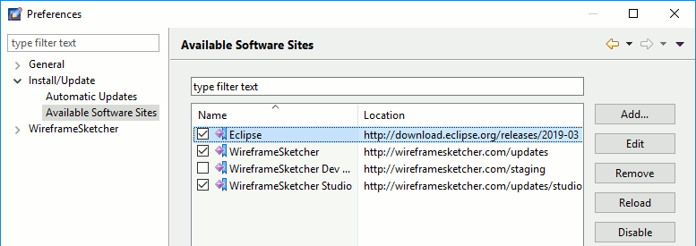
The Available Software Sites preference page lets you configure software sources used to check for updates. WireframeSketcher sources are also configured here. When you install extra plugins their sources will appear here to.
You might notice a disabled WireframeSketcher Dev Version software source here. We don’t recommend enabling it, unless you are asked to by our support team. It’s there to allow you to get some early fixes for bugs that you report to us.
SWT Spy Plugin
SWT Spy plugin allows you to convert your existing SWT UI into a wireframe that you can edit and revise afterwards.
To get started, open the dialog or window you want to mockup. Press Alt+Shift+F5 and the XML of the mockup will be copied into the clipboard. Open the “New Screen” wizard, and on the second page paste the XML. Hit Finish and you are done! Note that you can also paste the XML directly into a screen.
Technically Spy functionality is provided as a separate plugin: com.wireframesketcher.spy. You need to make sure that this plugin is included in your environment when you launch your Eclipse plugin or RCP application.
For more information and a video screencast please see the Spy plugin announcement.
There is swing2mockup community project that lets you do the same thing with your Swing UI!
Installing plugins
WireframeSketcher is based on Eclipse platform which means that you can extend it with various Eclipse plugins. One common requirement is the installation of version control plugins for Subversion, Git, Team Foundation Server, Perforce, Mercurial, Plastic SCM and others.
Here are a few online guides for some of these plugins:
- Installing Git plugin
- Installing Subversion plugin
- Installing TFS plugin
- Installing Perforce plugin
- Installing Mercurial plugin
Generally, to install version control plugins like Subclipse, Subversive, eGit, P4Eclipse (Perforce), Mercurial, Team Foundation Server (TFS), SourceAnywhere and others follow these steps:
1. Enable Eclipse update site using Window > Preferences > Install/Update > Available Software Sites:
2. Install the plugin from its update site using Help > Install New Software…. WireframeSketcher is based on Eclipse 2018-09 (4.9) if you need to know.