The latest release adds support for a much requested feature – configurable fonts. Until now the only supported font was the system font. This is a reasonably good default but things break when you try to edit the same screen file on different systems.
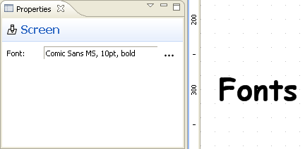
The latest version allows you to configure a font for each screen:

A global preference lets you to choose the default font to be used for new screens:

If you wish to edit a screen on multiple OSes then you need to choose a popular font that is present on all of them. Possible choices include fonts like Arial, Verdana and the often hated Comic Sans. Despite its reputation Comic Sans can be a good choice for screens with a sketchy unfinished look. It’s also very portable so it’s a good choice for the default font setting.
Other changes:
- Improved the visibility of the in-place text editor by changing the border color to blue
- Added support for opening screens from task attachments in Mylyn. This allows a better integration with JIRA, Bugzilla and Trac connectors.
- Fixed an issue with exporting multiple screen files from the command line
- Added a dedicated changelog page. Here you can see at a glance the changes in each version. When a version is too small for a dedicated blog post you can still find it’s description in the changelog.
Update your Eclipse and enjoy!
I’ve just released the next update. This time I bring you the Image widget. The name of the widget says it all, it allows you to include arbitrary images in your UI mockups. The main benefit of images is that they allow you to represent UI elements that are not included in the standard widget library.
To add an image to your mockup just drag it directly from the Project Explorer or Navigator views onto the editor canvas. The only restriction is that the image file must be part of an Eclipse project. Supported formats include PNG, JPEG and GIF.
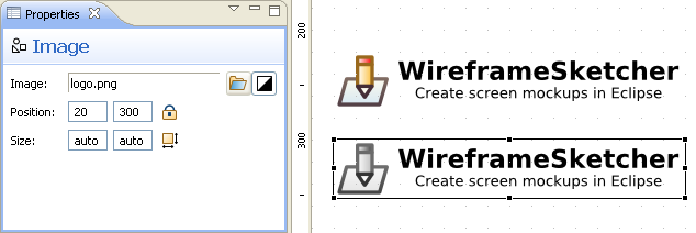
A small bonus is the possibility to convert color images to grayscale. This should help you to preserve the low-fidelity aspect of your mockups. Just use the black-and-white option in the Properties view:

Images are included by reference. In other words only the image path is stored inside the .screen file. Whenever possible, the stored path is relative to that of the .screen file.
Time for another release. This version took me almost two weeks to finish but I am proud to announce a new major feature: Master Screens.
Master screens, also known as master pages, allow the reuse of common layout and navigation elements across multiple screens. The way this feature works in WireframeSketcher is similar to server-side includes that are common in web applications. A screen can include as many other screens as needed. You can easily have one common layout screen included once or multiple header and footer pieces that are included independently. Masters can also be nested which is just mind-boggling.
Changes in included screens are automatically propagated and are visible as soon as you save the master. Internally, masters are referenced using relative links which allows you to move screens together without breaking anything.
I really should have done a video screencast of this feature, but for now you’ll have to install the latest version to see what I am talking about.
Other changes:
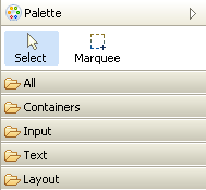
- Palette categories. Spend less time looking for a widget:

- Text in-place editing is started as soon as the widget is added from the palette. This saves you a double-click.
- Double-click now works in icon selection dialog.
- This blog accepts comments thanks to Disqus. Yet another way for you to reach me with your feedback!